Renowned as the first major update to both the visual outlook and the feel of Apple products in the post-Steve Jobs era, IOS 7 broke down the door for elite, sleek app design. In designing apps for the IOS 7, you have a lot of aesthetic options. iPhones are gourmet smartphones; IOS users have high expectations with regard to UX design and if your app appears amateur, it will sink the perception of your business and you will lose both money and respect. The look and feel to your app is as important as its functionality. You must cater to UX trends to appear on the cutting edge. Here’s what’s popular today:
Although one would expect two dimensions when utilizing “flat” design, the trend is quite the contrary. One of the major futuristic visual flairs of IOS 7 apps is the use of depth. Depth can be achieved in a number of ways. For example, instead of dividing lines, soft blur is often used to create a sense of depth and emphasize the urgency of the element in use. When interacting with a different element, the focus shifts as necessary. The lack of dividing lines emphasizes functionality, reduces clutter, and feels freer. The sense of depth creates the illusion of seemingly endless functionality. Your business will look like a highly-capable enterprise.
Making use of the swipe gesture is another major trend in IOS 7 apps. Swipe not only allows for easy navigation between functions, swiping to unlock another screen in the app, but also can be used to contribute to the depth. Swiping an element within a page can reveal either functions (such as deleting emails) or elements beneath. The ease of swiping requires only one thumb, making it an incredibly convenient gesture.
The swipe is not only convenient, it’s more fun than simply pushing a button and gives the user a sense of space, making your customers happy.
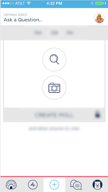
Convenience being central to the goal of any app’s functionality, IOS 7 apps are often utilizing simple color schemes to simplify the equation. Rather than bombard the user with a rainbow, IOS 7 apps often utilize a white backdrop for negative space, along with simple, vibrant color scheme emphasizing functionality. Red means no. Green means yes. Icons in use often are filled with white while inactive icons are translucent. The simplification of fonts goes hand in hand with the coloring, focusing more on texture and weight than style.
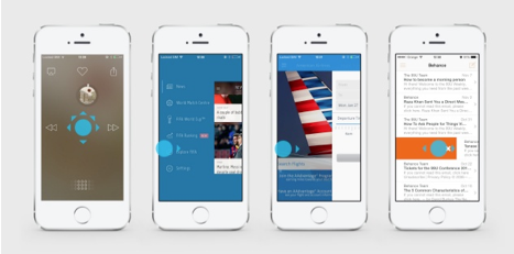
While minimal seems to be the keyword with regard to IOS 7 app design, one trend breaks the mold with regard to mobile web design: Parallax Scrolling. Parallax Scrolling is a design technique in which as the user scrolls down the web page, the graphics move with the scroller, creating a story. Examples of Parallax Scrolling can be found here.
While there’s no given formula for success in IOS app design, by staying on top of the trends, you can assure your business is being reflected in the most positive light. With the speed of the playing field at an all-time high, it’s vital that you are in the know of current trends.